Work
About
Contact
A Bit of Beetle
Responsive Advertising Agency
All
Content
Dr. Vranjes Firenze Limone Cedrato ADV
Strategy - Branding - Digital - Content
A Bit of Beetle
Branding - Digital - Content
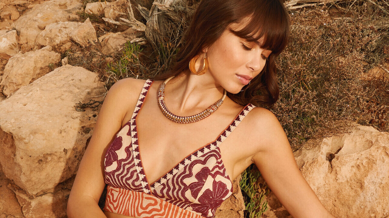
Loud Apparel
Content
Dr.Vranjes Firenze
Strategy - Content
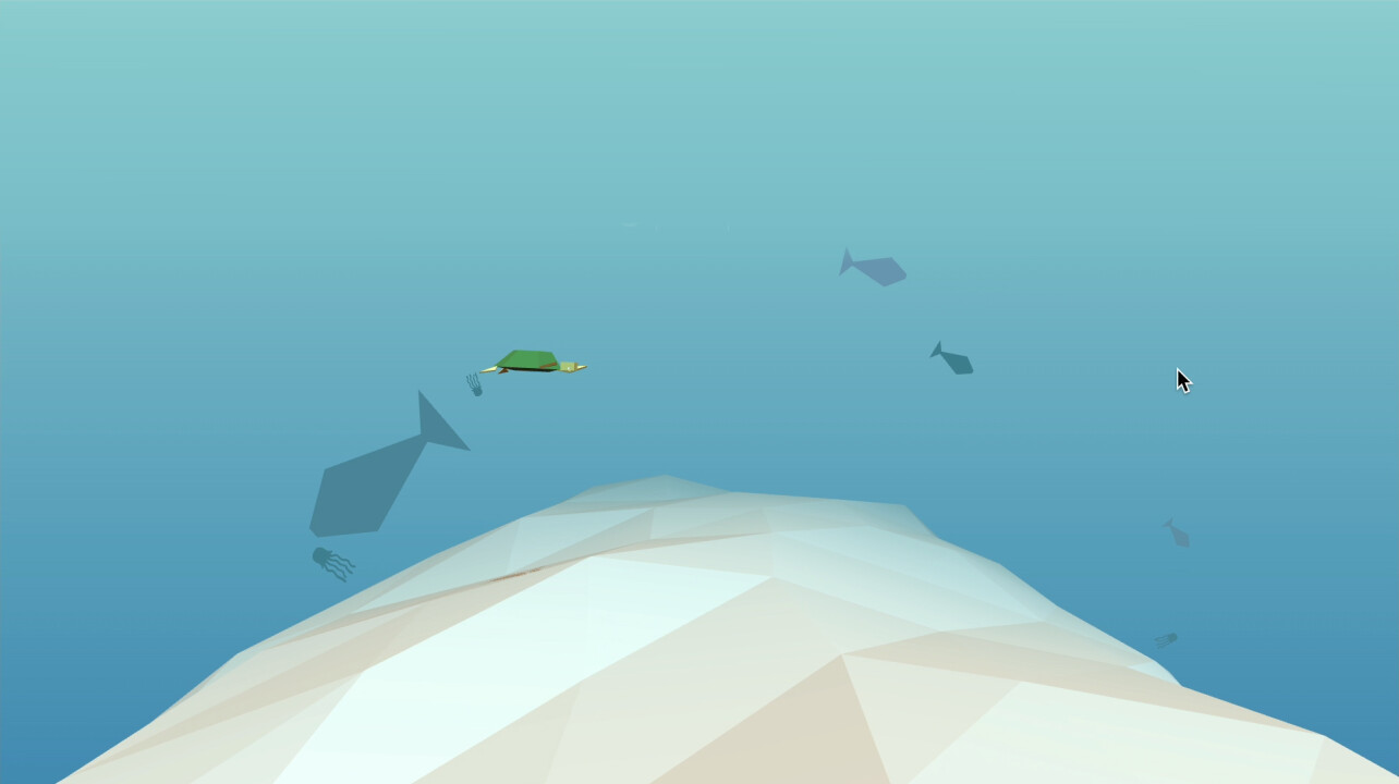
Kobak: motion video and illustrations for Ecomondo 24
Strategy - Content
TNS: advertising campaign
Strategy - Branding - Digital - Content
Nova Fides
Strategy - Digital - Content
Kobak @ Welcage Milano
Branding - Digital - Content
Coquinarius
Digital - Content
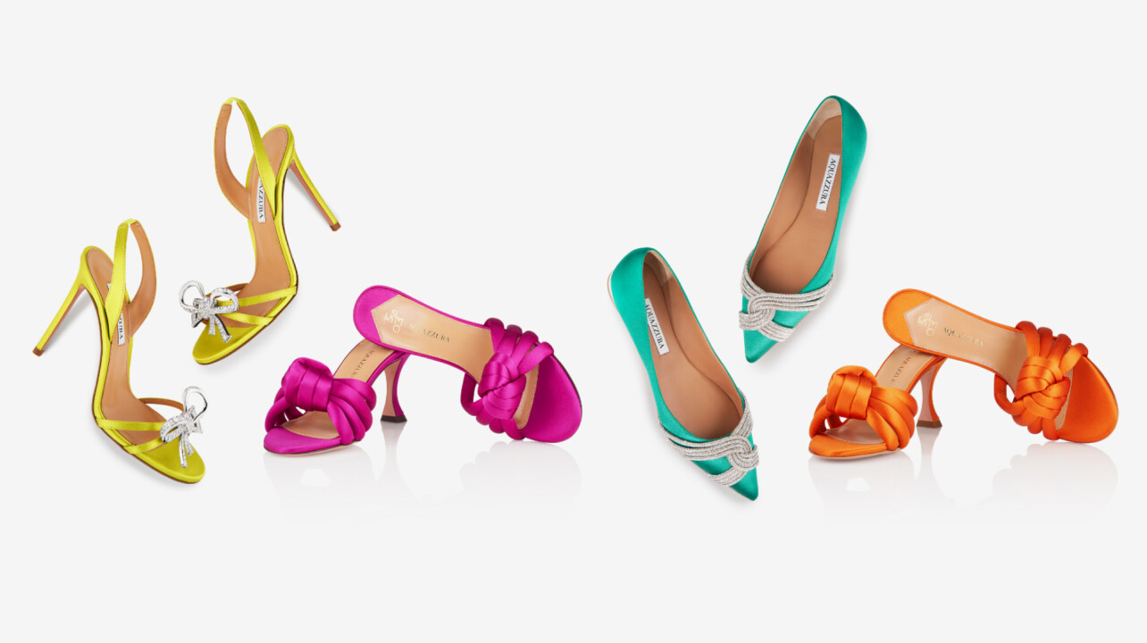
AQUAZZURA BAGS
Strategy - Branding - Digital - Content
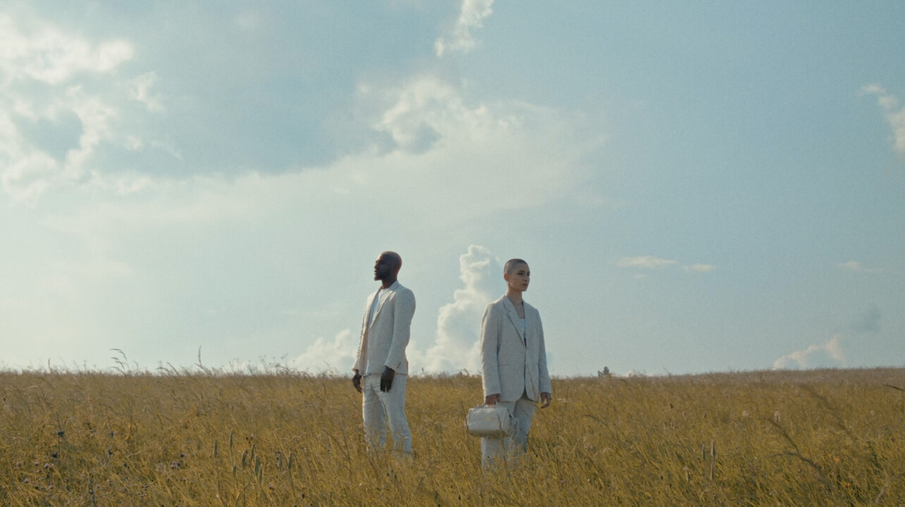
Vamas, an evolving company
Strategy - Branding - Digital - Content
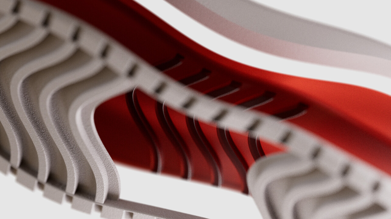
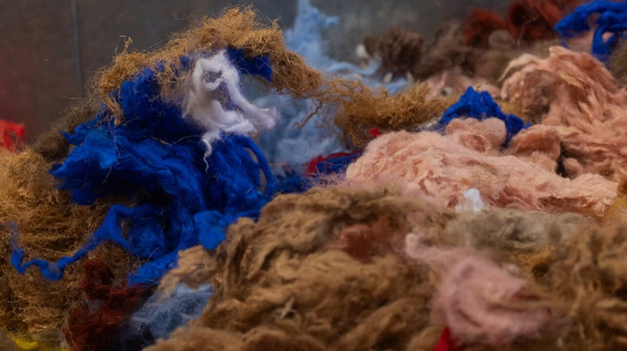
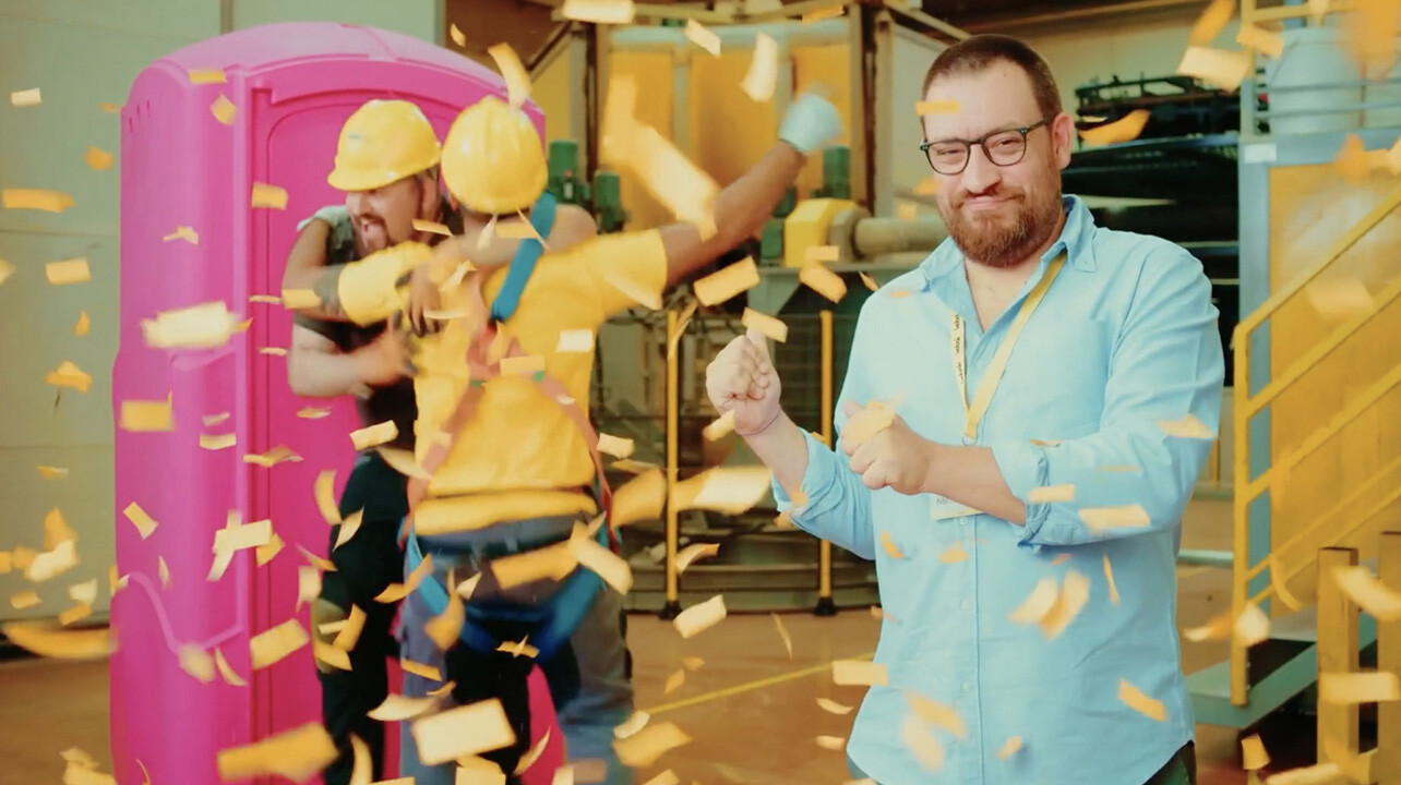
Furpile Industry
Strategy - Digital - Content
Kobak a project in color
Strategy - Content
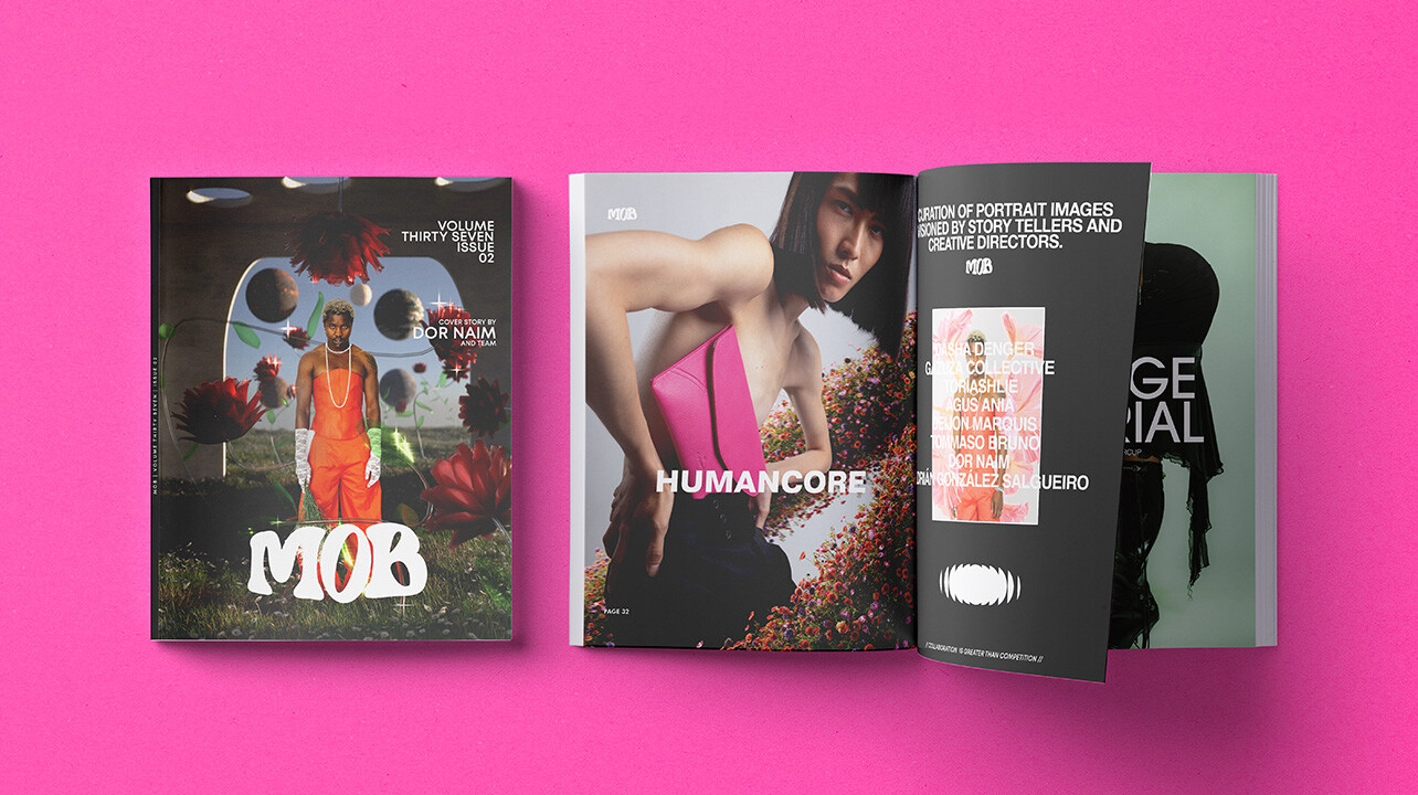
Humancore editorial
Strategy - Branding - Digital - Content
Même Road inside the project
Strategy - Digital
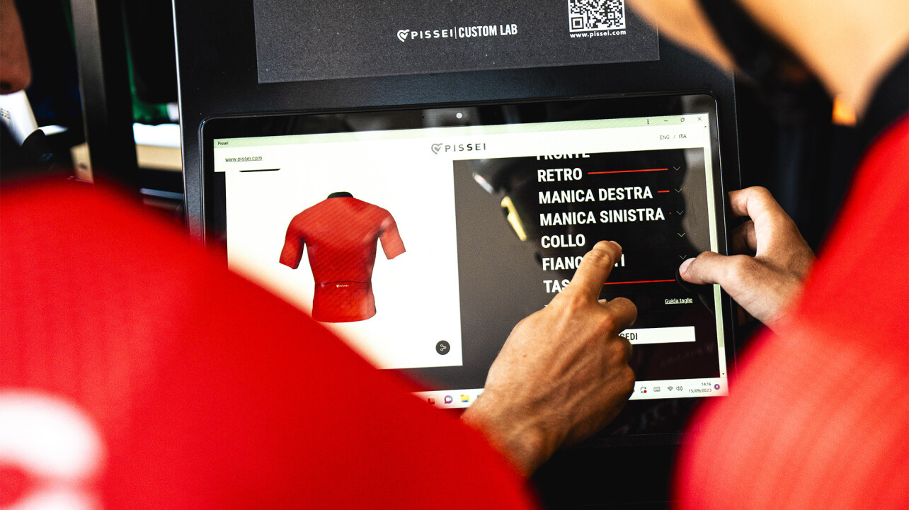
Pissei effortless customization
Strategy - Digital - Content
CRAMA, by the sea
Strategy - Digital - Content
Biancalani, a perfect partner
Strategy - Branding - Digital - Content
Temera innovation trendmark
Strategy - Content
AQUAZZURA Content production
Strategy - Branding - Content
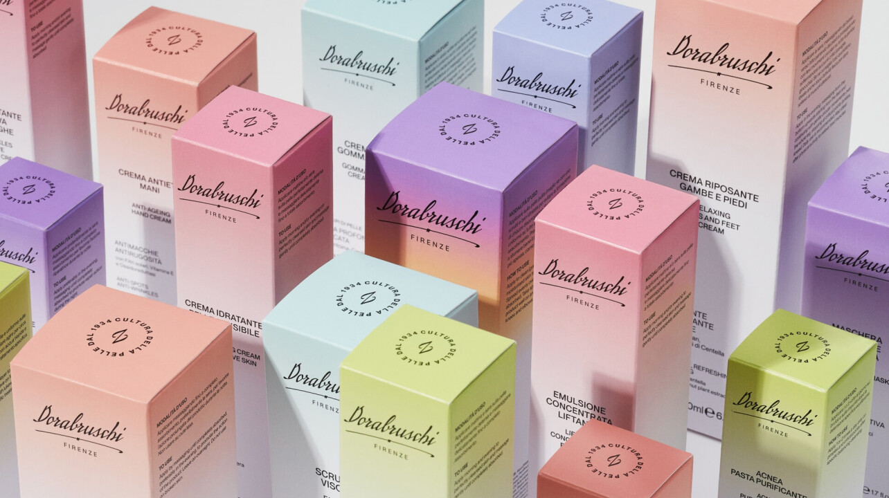
Dorabruschi from 1934 to the present
Strategy - Digital - Content
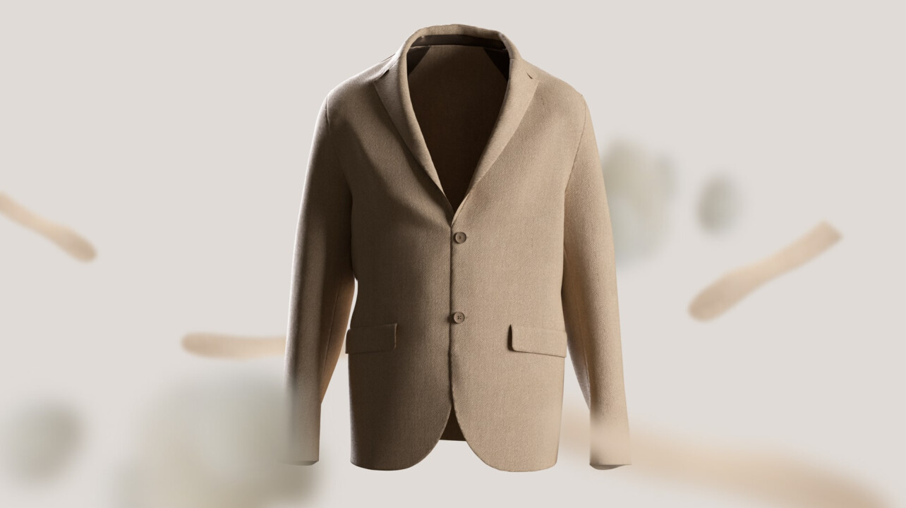
Zetafonts
character to wear
Branding - Content
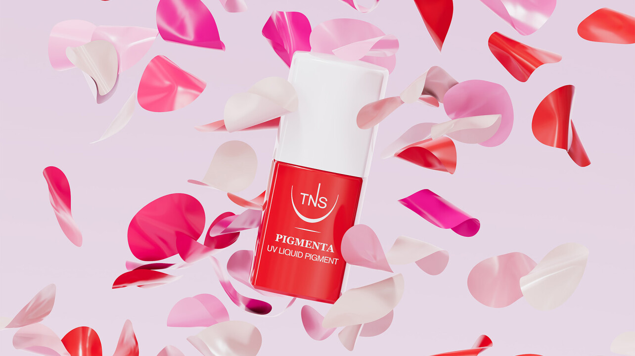
Pigmenta:
a shaping a system
Branding - Digital - Content
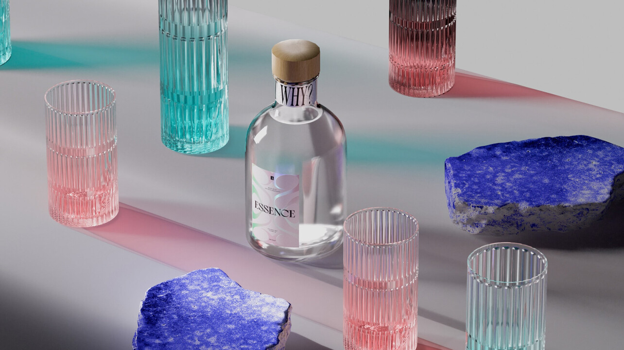
RAD Essence, unimaginable fragrance
Strategy - Content
TNS Firenze SS23 Color collection
Branding - Digital
Terranova
a new vision
Digital
Beste
focus on the process
Branding - Digital - Content
Ginori 1735
Strategy - Branding - Content
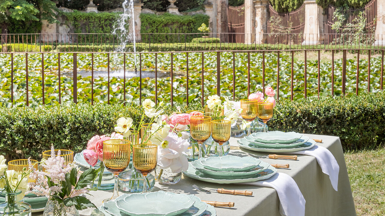
AQUAZZURA CASA
Backstage of an Italian picnic
Branding - Digital - Content
CasaMarta Foundation
Strategy - Branding - Content
MOACONCEPT
future is Hu-rban
Digital
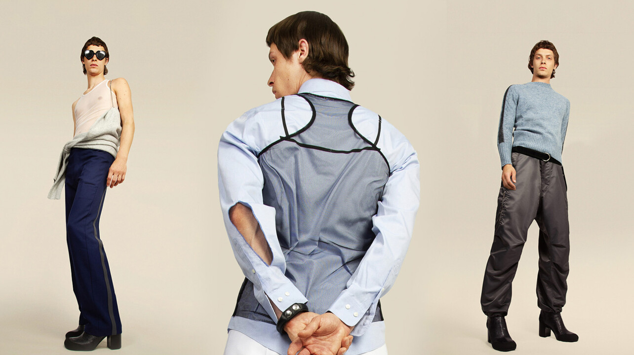
Random Identities
non-binary fashion
Content
AQUAZZURA CASA
set of crystal goblets
Branding - Content
Ocarina: Restyling
Content
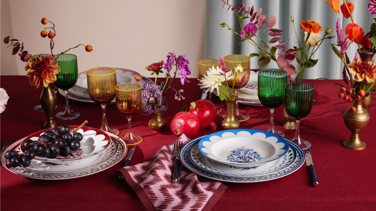
AQUAZZURRA CASA
'Jaipur' and 'Cherry Blossom' collection
Digital - Content
CiaoGym
athleisure eCommerce
Strategy - Branding
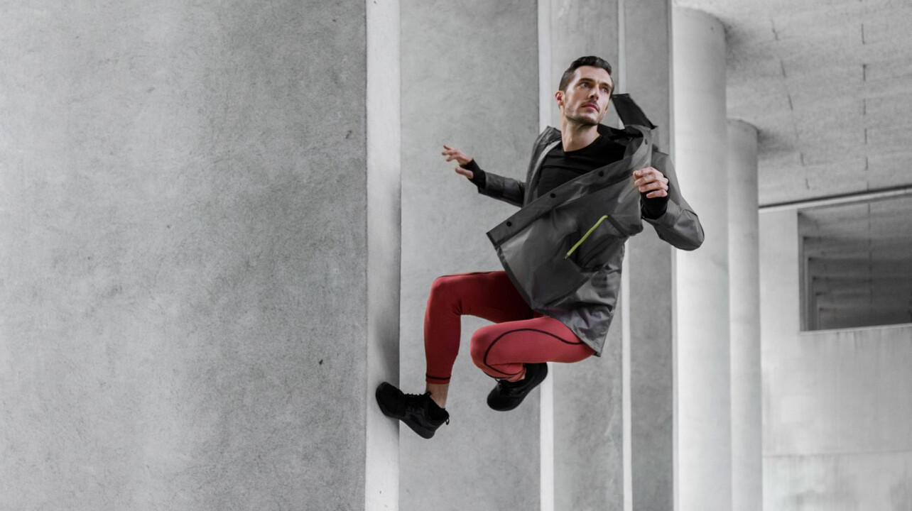
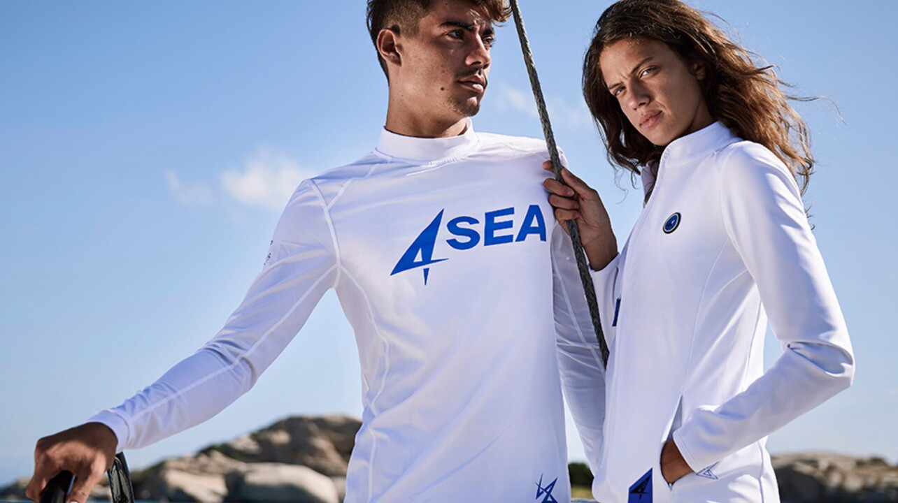
4Sea
fashion and sustainability
Digital - Content
Falorni Pharma
Strategy - Branding - Content
Bianchi e Nardi 1946
Strategy - Branding - Digital - Content
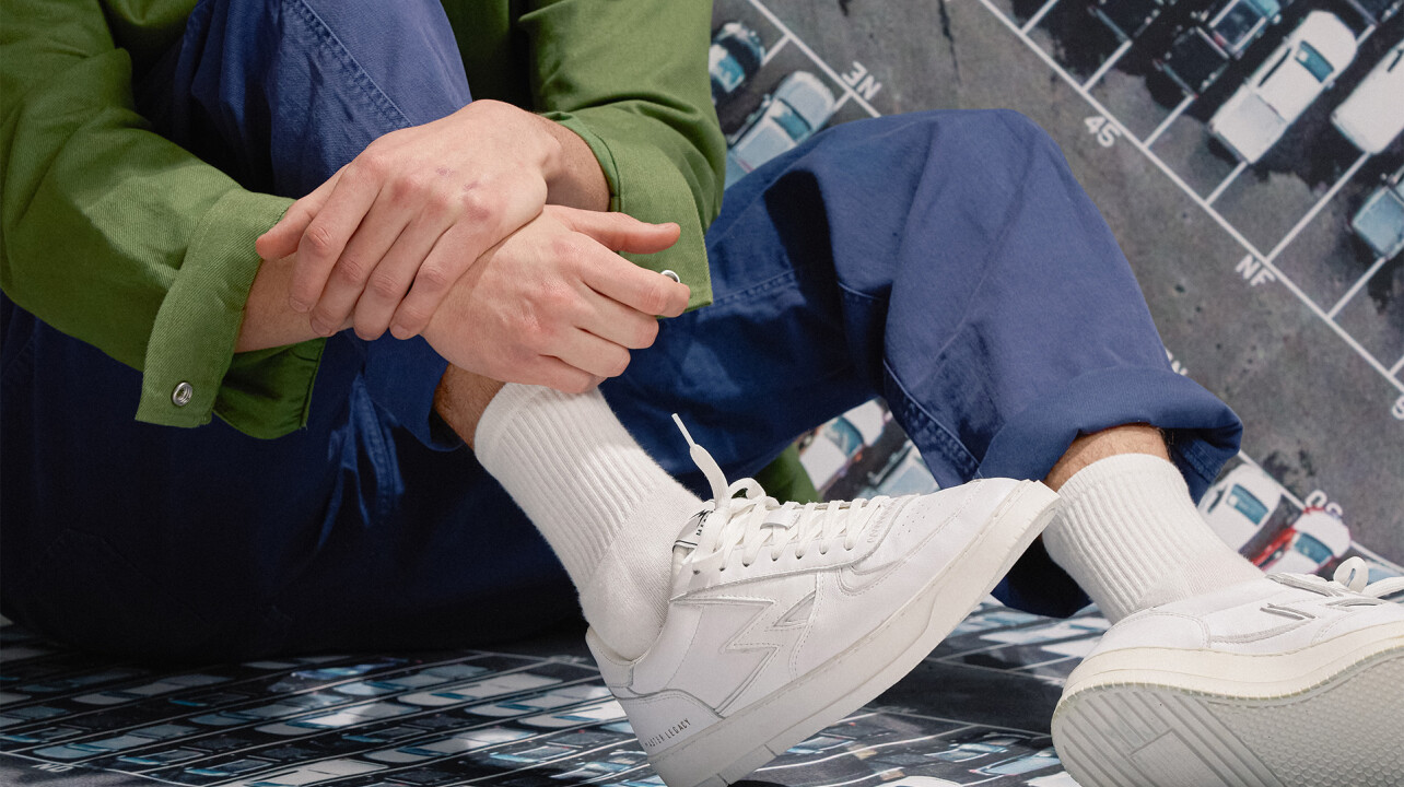
The FLEXX: A New Identity
Strategy - Branding - Digital - Content
Borgo
Content
NR Rapisardi
Phonak: Advertising Campaign
Branding - Content
Bianchi e Nardi x ACF Fiorentina - Editorial
Digital - Content
Tre Effe: Digital Brand Identity and Web Design
Digital - Content
Manteco: Website Design & Development
Content
Gucci CF Florentia
Content
Monobi
Strategy - Branding - Digital - Content
Montuliveto
Branding - Digital - Content
Severino Becagli
Rai: Web Portals
Strategy - Branding - Digital - Content
La Cova
Branding - Content
Gesto
Strategy
Branding
Digital
Content
View Project