Gesto
Branding - Content
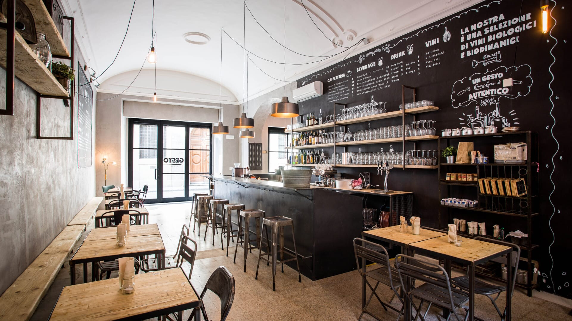
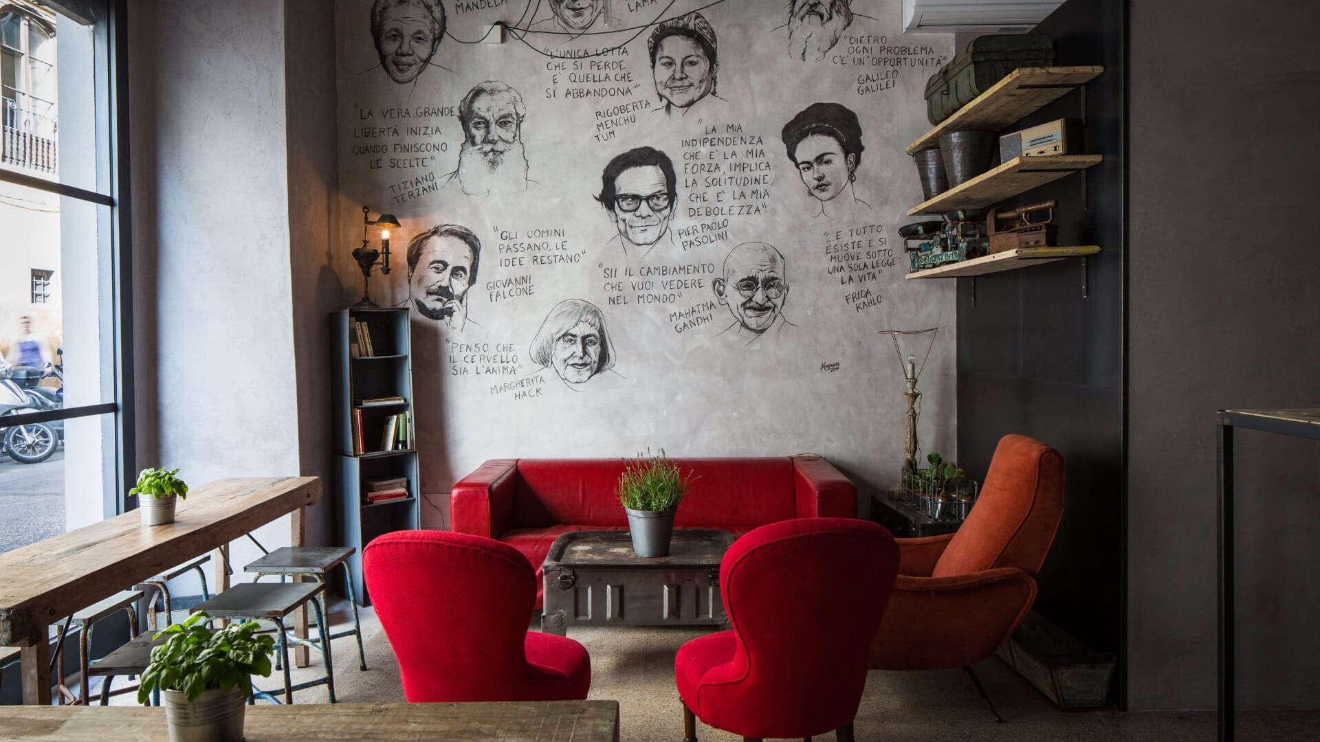
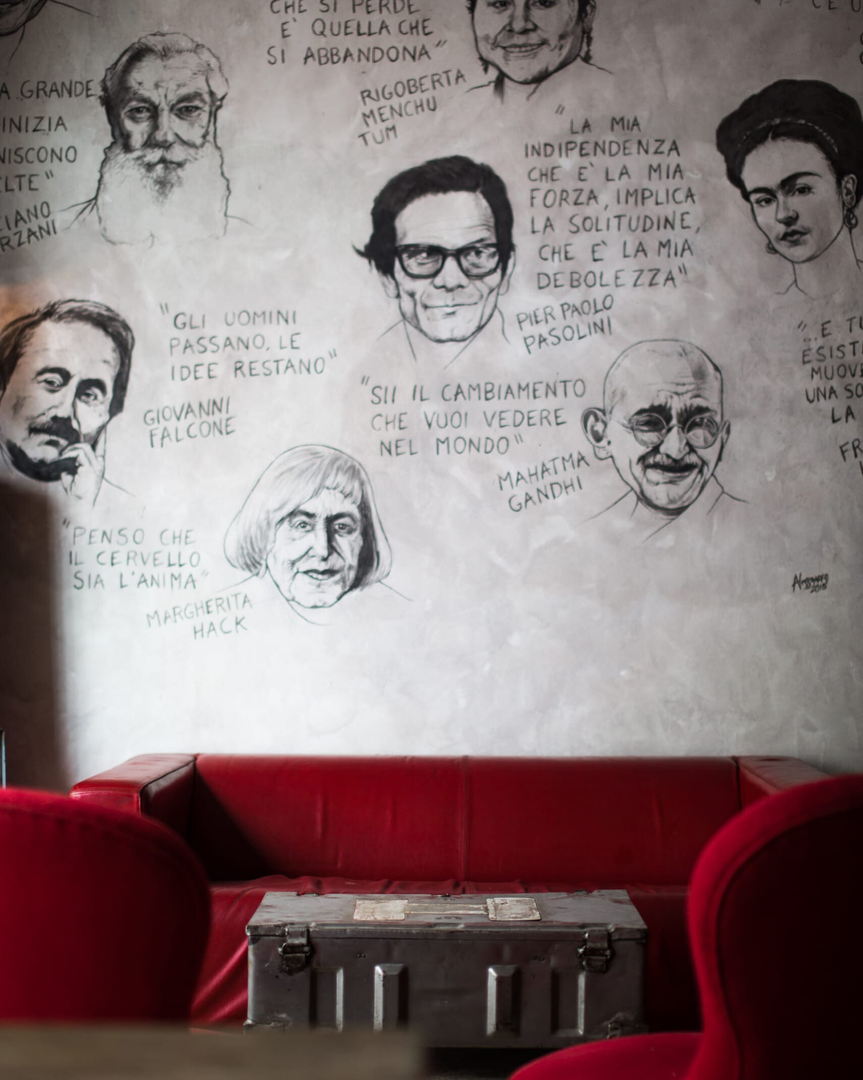
Gesto is not just a venue; it’s a statement of awareness. Gesto is a place for everyone. Everyone is part of the same law of cause and effect, no one excluded.
Deliverables
Art Direction
Graphic design
Illustration
Branding
Digital content
The idea of avoiding a static coordinated image arose from analyzing gesture as an act of movement. To move means to change, to evolve. This concept forms the foundation of Gesto’s philosophy because it reflects the essence of life, the cyclic nature of the seasons, and, consequently, the seasonal foods that Gesto offers.
Brand Identity
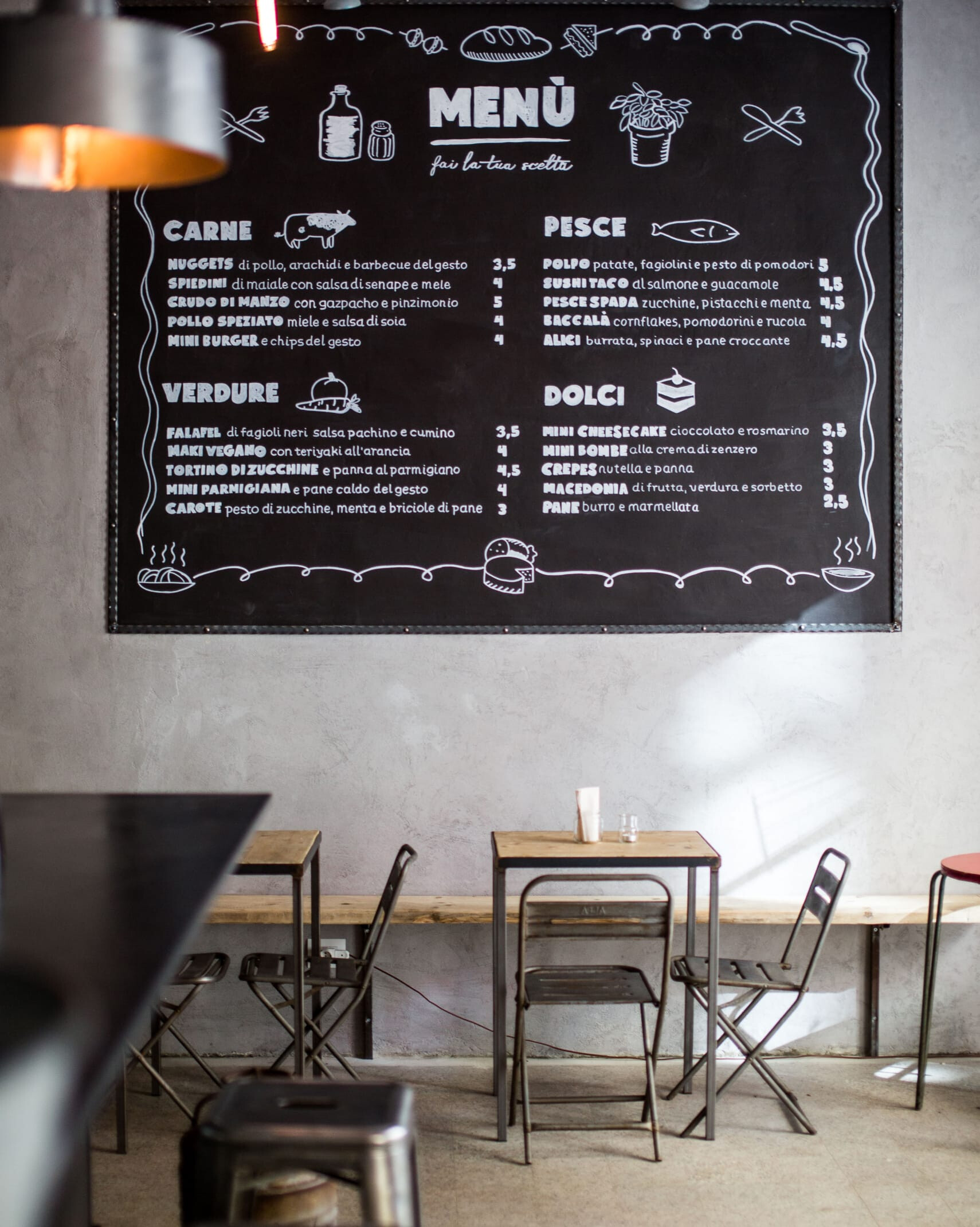
WE RAD translated this concept into graphic symbols, turning the logo itself into a gesture. For the typography, the studio drew inspiration from an era before computers—a time when awareness was intrinsic. The icons created are intentionally simple, as if anyone could have drawn them. This was the studio's vision. The medium, a chalkboard that can be erased and rewritten, serves as the fertile ground where the brand image comes to life.





Discover how we dared also withTuscan Taste Reimagined
Keep scrolling - Keep scrolling -
Keep scrolling - Keep scrolling -
Keep scrolling - Keep scrolling -
The right thing over the new thing
View Project