Ocarina: Restyling
Branding - Content
Soft, organic shapes evoke what sound inspires, shaping the restyling of the logo and Brand Identity for Ocarina, the music player that grows with children.
Deliverables
Art & Creative Direction
Restyling Logo
Brand Identity
Digital Brand Book (Brando)
Illustrations
Motion Graphic
Packaging Design
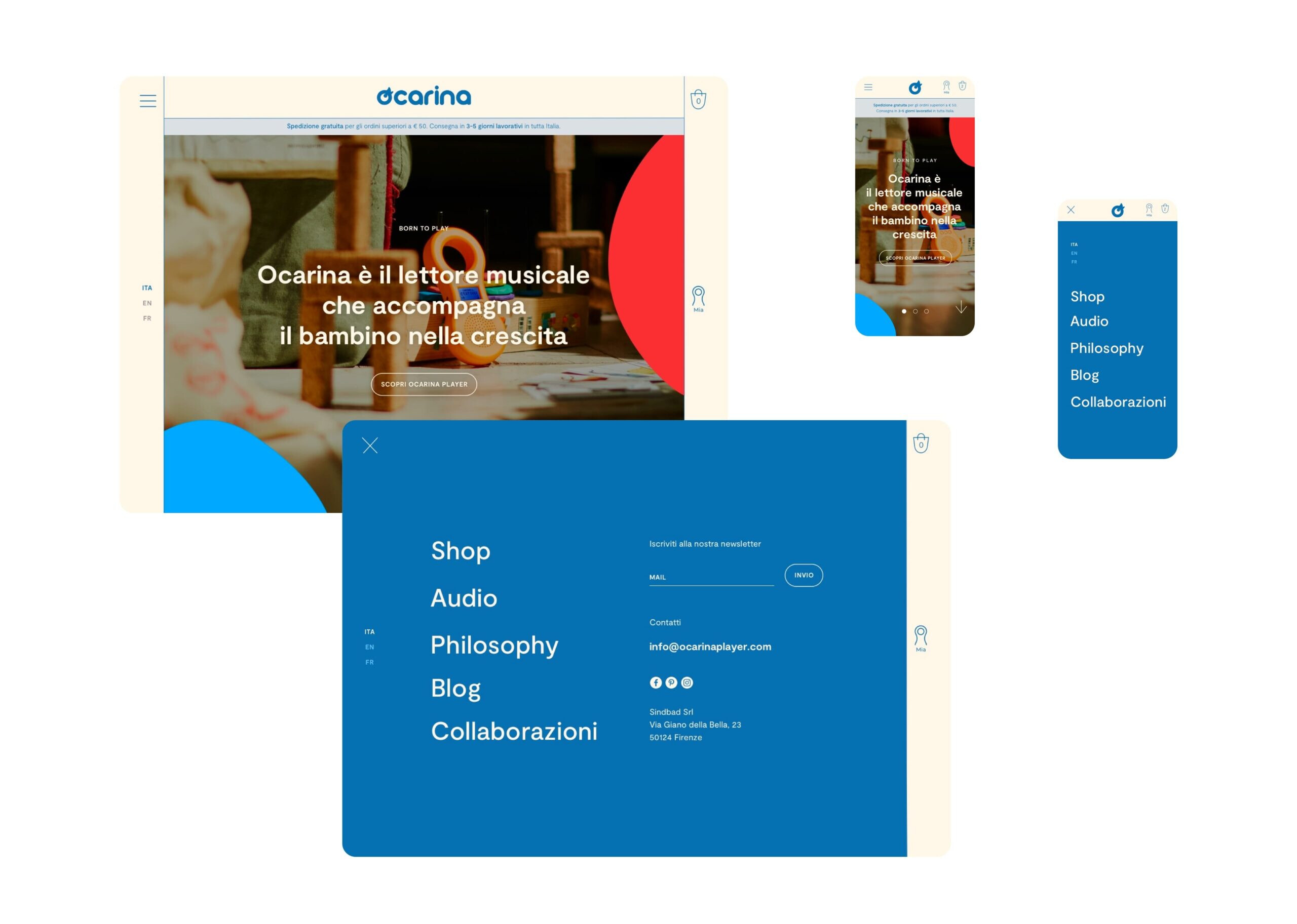
UX e UI
Visit the website
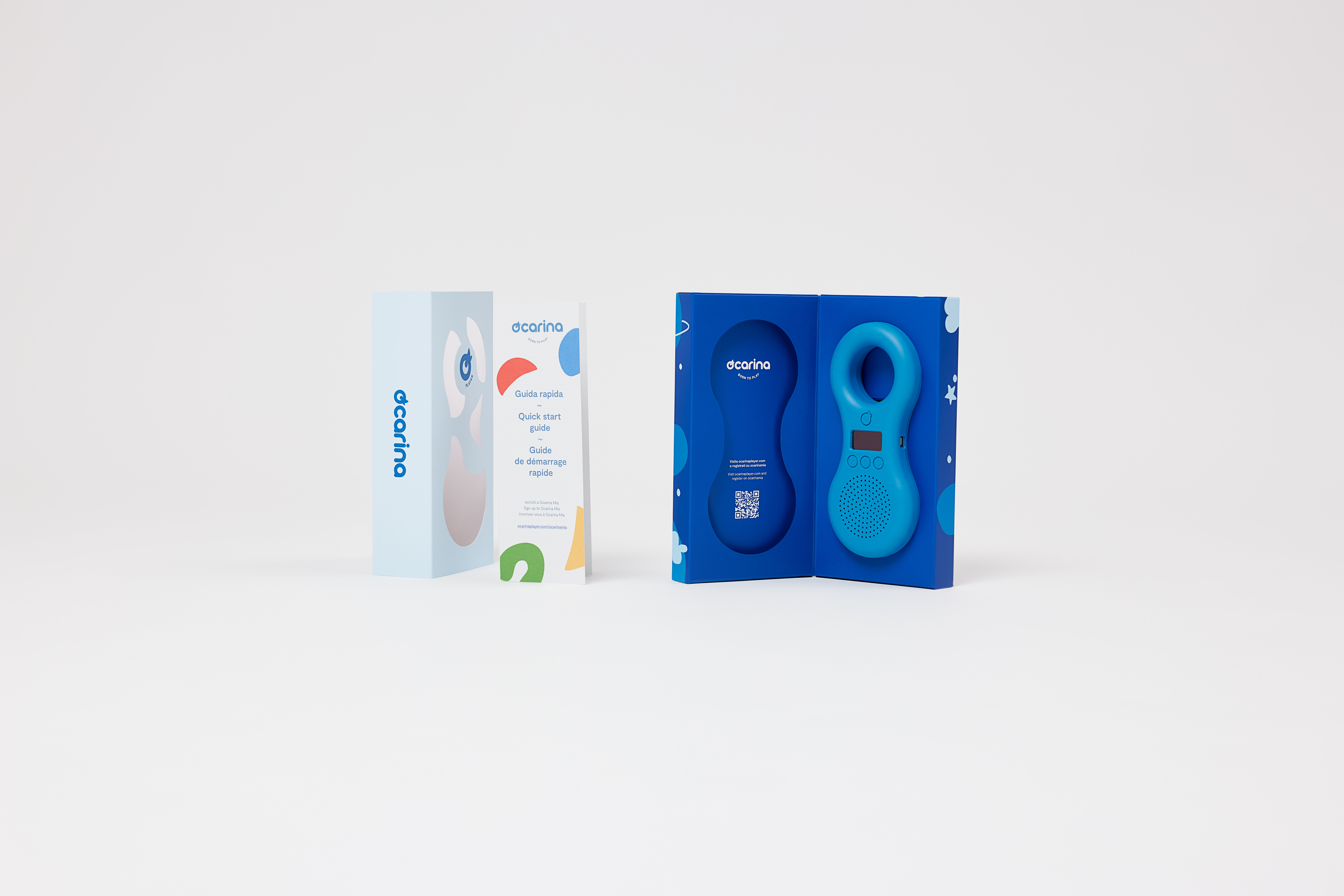
Sounds, shapes, and colors
The special edition products for which we designed illustrations and packaging stand out for the themes of the audio, which are associated with the meanings of the colors.
Each product carries with it a micro-world of sounds, shapes, and colors that comes to life. The illustrations visually convey the sounds and themes of the audio loaded into the products.

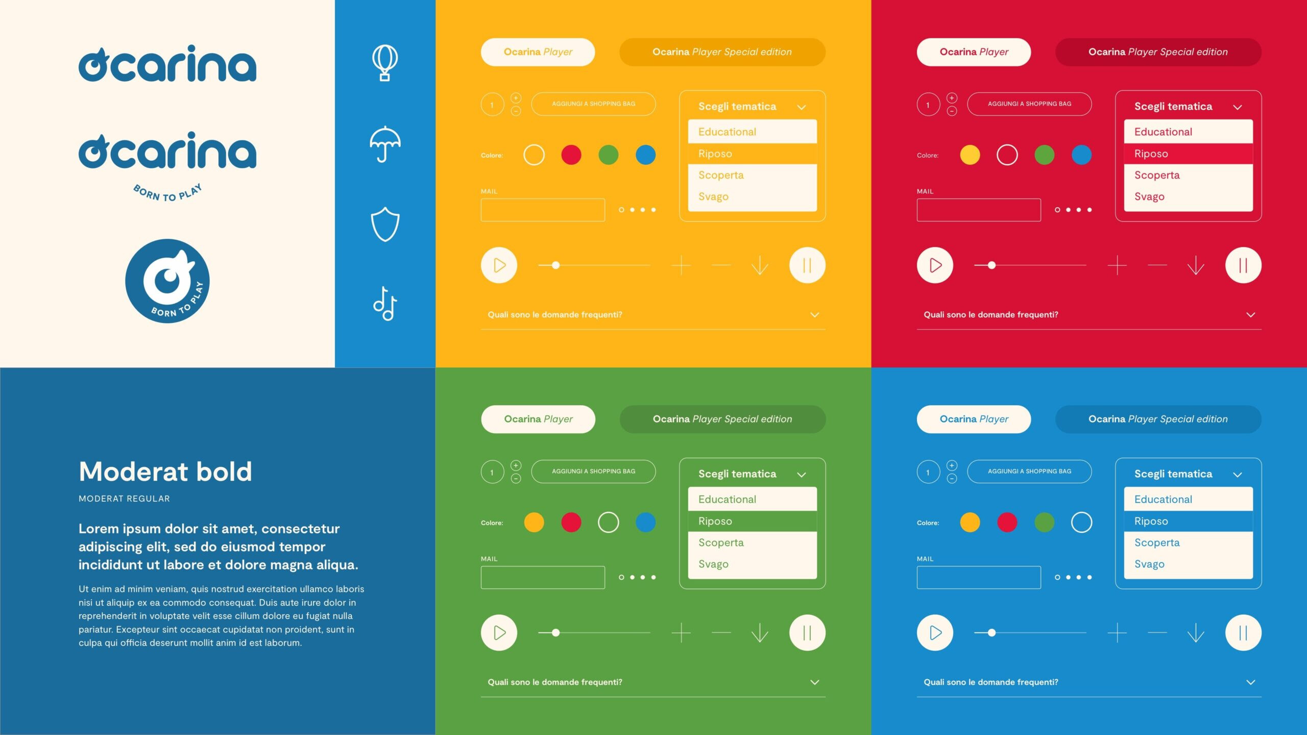

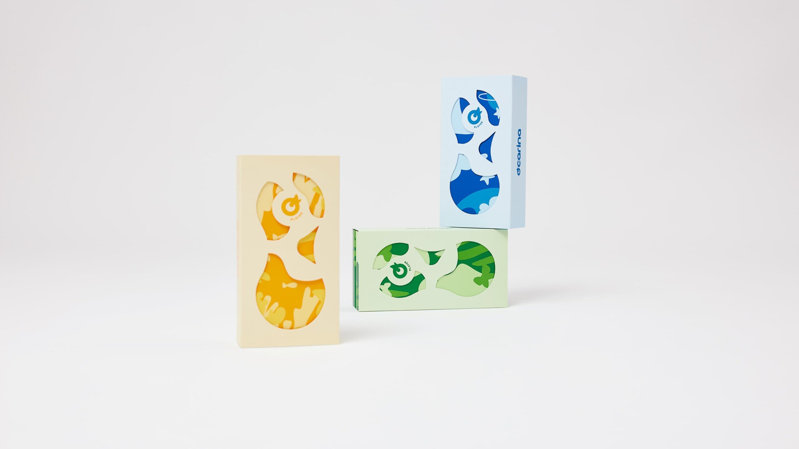
Ocarina is the music player that accompanies children as they grow. Through imagination, music can create shapes and colors that change, evolve, and come to life. Sound and image are not separate elements; they speak and animate together.

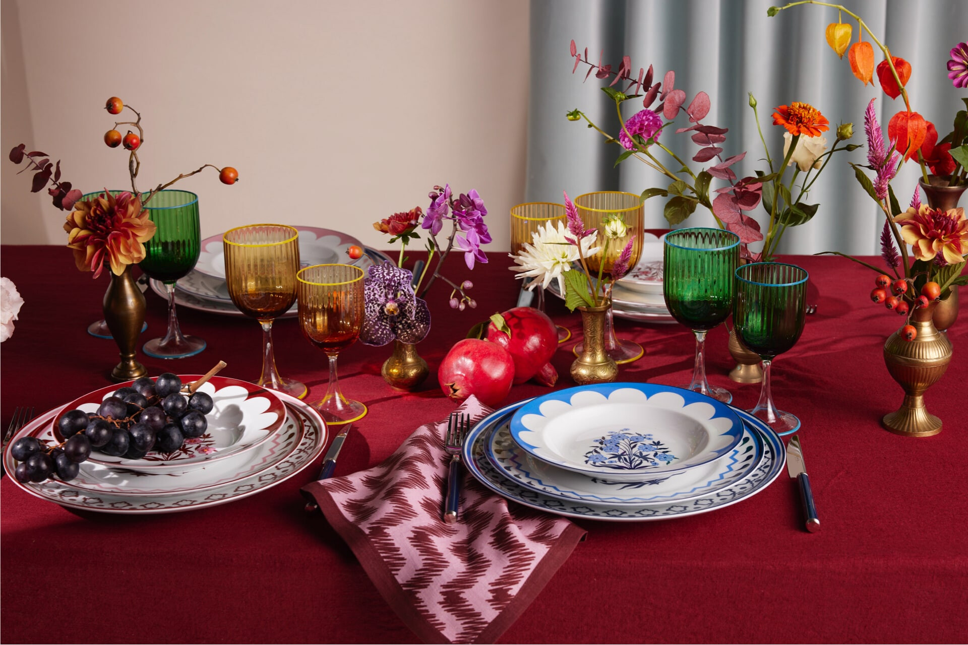
Discover how we dared also withAQUAZZURA CASA
Keep scrolling - Keep scrolling -
Keep scrolling - Keep scrolling -
Keep scrolling - Keep scrolling -
- Strategy
- Branding
- Digital
- Content
View Project