11 - 07 - 2023
Beauty Trend 2024 the new direction of cosmetics
Beauty Trend 2024 the new direction of cosmetics
How fast does the virtual world go? The web is moving, changing direction, going forward, going backward, an amount of dynamic stimuli and impulses that change or intensify a stance every day.
It is difficult to keep up, to understand what the momentary trends are, and to be able to develop a strategy that can cover a long term style. The stumbling block to be stemmed is this, that is, being able to carp about web trends and implement a strategy on top of them that can endure over time and adapt to different temporal and therefore stylistic contexts.
In this article we explore the world of beauty trends for 2024, starting with a case history of our own that involved a rebranding project for the cosmetic brand Dorabruschi.
Dorabruschi: Tuscan-style cosmetics
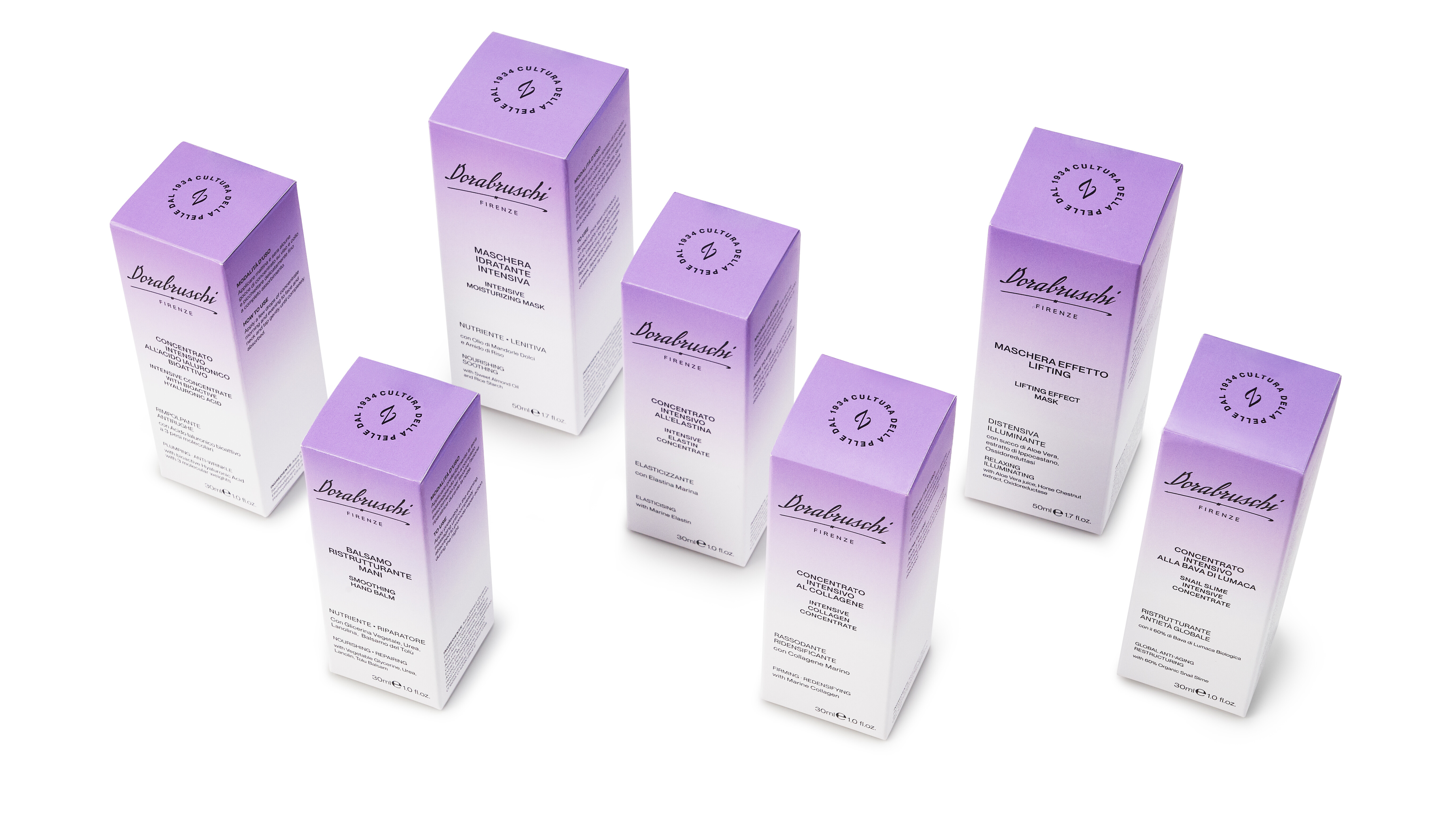
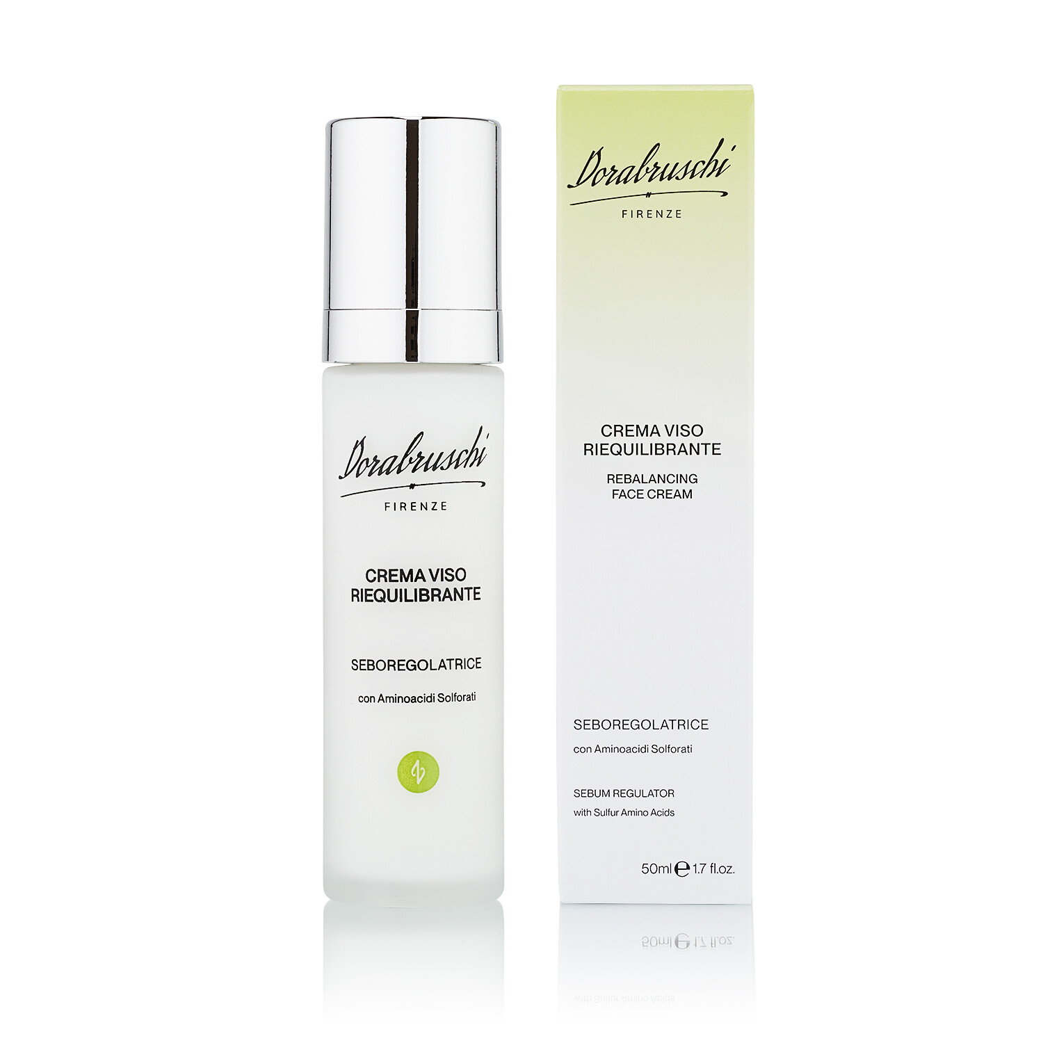
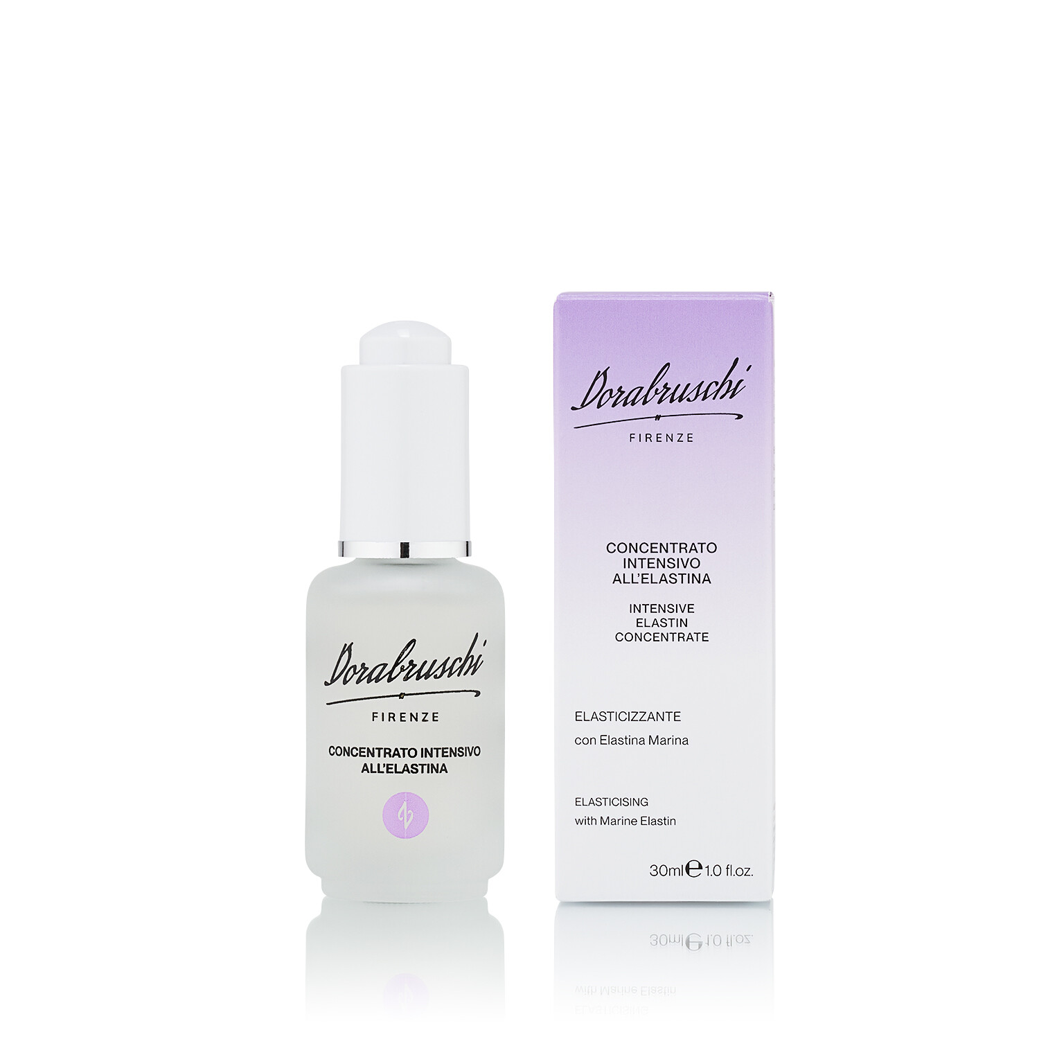
Dorabruschi Firenze is a Florentine cosmetics company that has its roots in the early 1900s, more precisely 1934. For this brand, we were commissioned to follow the positioning strategy, the rebranding process, setting of genetics and declination on the primary and secondary packaging of the entire product range - also subject to restyling.
The case study in detail
The entire project had as its starting point the creation of the new logo starting from the restyling of the company's first brand, identifying the company's values and positioning them within the first elements of genetics.
The brand tells of a transparent relationship between the company and its customers, one of trust and a story that stems from a great passion of its founder: Dora Bruschi.
To take action, we had to proceed beforehand with an analysis of the target market and new strategies and trends in the industry.
What, why and how of the cosmetics world
To begin this analysis, we set out to start with 3 basic questions: the what, the why, and the how of how brand competitors move in the market. We focused primarily on the why and the how, so as to understand what motivates cosmetic brands to communicate their brands and how they do so.
Focusing on the why allowed us to examine the purpose of all brand competitors and clearly delineate the why of the Dorabruschi brand: to tell through the payoff - Skin Culture since 1934 - all the experience, know-how, and the relationship of trust that the brand weaves every day with the end consumer.
Our analysis then moved on to the study of the market, that is, understanding how users move online in the study of cosmetic products and how they search on the web. With this in mind, we identified a list of the 10 most frequently asked questions inherent in the world of cosmetics and skincare:
- Is skincare every night really good for your skin?
- What is your skincare for perfect skin?
- What is one skincare mistake we are all born making?
- Do you know how to structure a skincare routine?
- What does the perfect skincare routine look like for the 20-30 age group?
- What is your beauty routine?
- What are the steps for a good skincare routine?
- Is skincare for a man gay?
- What are your daily skincare routine?
- What do you think of the Korean skincare routine?
Studying these questions prompted us to outline all Dorabruschi products and define their tree based on the market needs and demands of the average consumer.
Buyer personas beauty: what is the consumer of 2024?
To bring forward a rebranding fit for the market, we analyzed the end consumer the brand will target. Through a study on the trend and forecasting portal WGSN, we were able to compile a list of characteristics of the users of the years to come.
Future shock
Consumer 3.0 faces with uncertainty and stress the future and the stimulations arising from the market, all caused by the health emergency, the conflict in Ukraine, and the rising cost of living.
Overstimulation
People are increasingly interconnected with each other. This overstimulation from the digital and non-digital world has shown a decline in attention in the global population. The cause of this decline can be found in the out-of-control increase in stimulation, and here the average user's practice of switching from one activity to another without ever focusing consistently on one.
The connectors
The consumer of 2024 wants to connect everywhere. He or she therefore prefers online purchases to those in the physical store and is therefore a consumer who prizes the transparency of brands. Value for money, attention to sustainability, and production and authentication information on labels and tags are factors that can determine purchase by new users. Both online and on the packaging, therefore, all the necessary information should always be displayed, in order to create a general overview of the product and the brand that sells it, so as to further stimulate the consumer to purchase.
The new sensorialists
We find this characteristic in all consumers of 2023 and 2024. The new sensorialist is today's consumer who constantly oscillates between the digital and analog worlds, is always looking for the best, easiest and smoothest shopping experience. A consumer who wants to combine the ability to "touch and feel" a product via an online device.
The new beauty trends
Based on analyzed data and research through the WGSN portal on the cosmetic world, we learned that: trends for the coming year include a return to simplicity, linear and minimal shapes. The simplicity of forms allows the content to be appreciated and make it clear at a glance what we are seeing. On the analogue level, so in this case, at the level of packaging, each product must carry all the information needed to be understood by the end user and must feature linear, easy-to-read and very light fonts.
Digitally, too, the user is looking for intuitive content that does not weigh down but manages to stimulate with few words and with the use of colors, shapes and lettering that are easy to assimilate.
Beauty Trends 2024 issues a call for the return of simplicity and transparency. An ode for every brand to show themselves for who they are and to make every value a pivotal point to be shown and discovered by all consumers. The latter feature is able to establish a feeling of trust with users right away and consequently, build greater user loyalty.
An essential approach
The Dorabruschi project was a multi-pronged effort that followed a clearly delineated and scheduled process. Prior data analysis acted as a pivot to start with clear ideas and a precise goal; later, creativity and intuition came into play.
From the study of trends, we set this project on transparency and simplicity. Simplicity not meant in the sense of superficiality, but in the realization of a work that was easy to understand, able to channel users toward the brand's goal, which is to convey knowledge of skin and experience in knowing how to care for it.
From chaos to chromatic simplicity
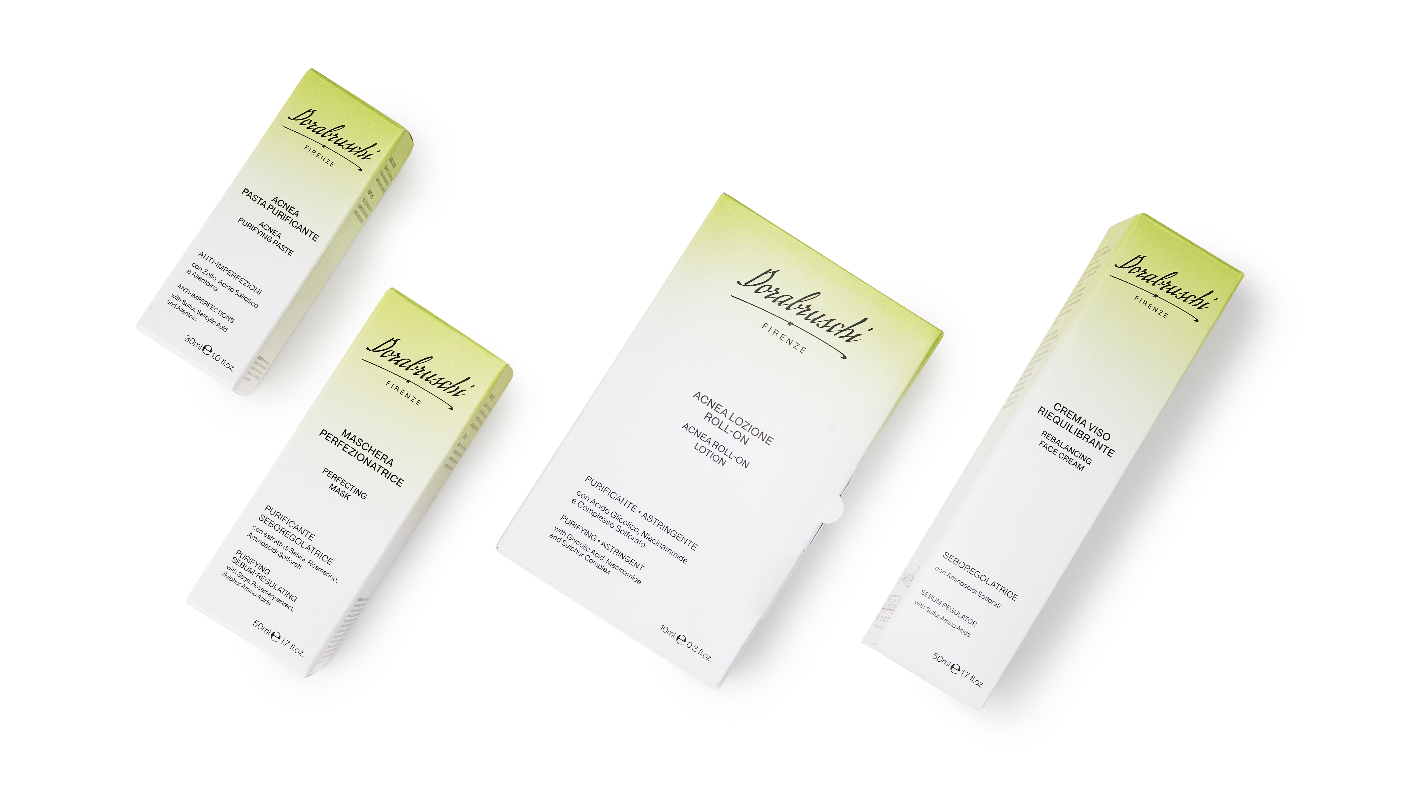
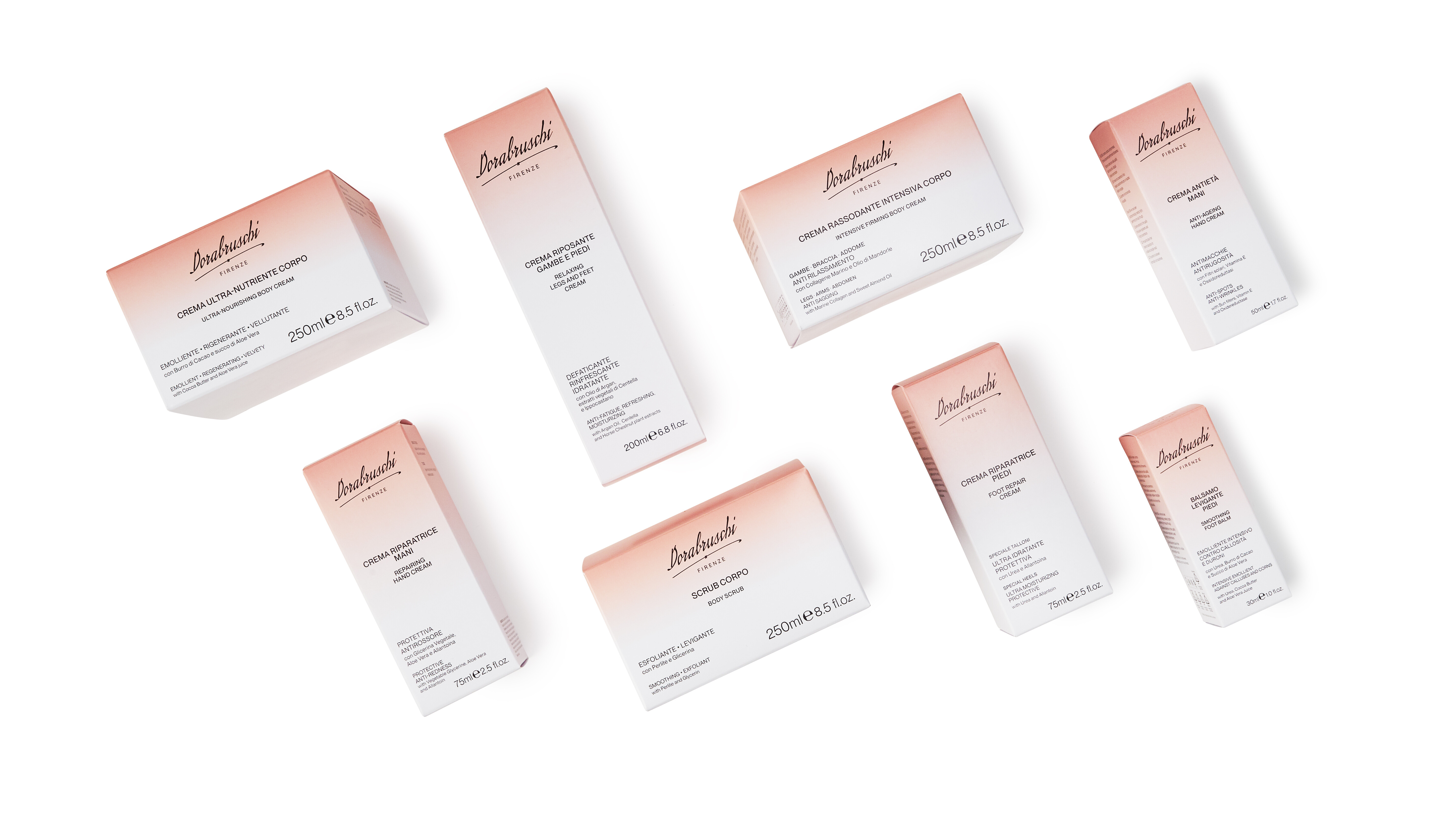
To give the brand a rationale, the first part of the project led us to clustering all the products according to their ultimate function. By using a communication flowschart, it was possible to put all the brand's products in black and white and better understand the brand's point of view. The next step was to organize, and sort the products following the logic of colors by veering toward lightness of tone and playing with shades. The brand's pivotal concepts, Heritage and Effectiveness were rendered on the secondary packaging through color gradients. This graphic solution allows the user to be guided in reading the information from top to bottom. Shading is also a synthesis of the brand's value narrative i.e., product transparency.
Transparency and sustainability
In perfect harmony with recent years, sustainability leads the way. The climate crisis has confronted everyone with the problem and thus the search for solutions that even in a small way can do so much. That is why during the rebranding we decided to take some steps that allowed us to present a project that takes care of the environment as well as the skin.
With this in mind, our choice for packaging went toward Fedrigoni Materia Viva ECO100 paper, a paper that is entirely recycled and therefore makes up for the energy expenditure of its production with its easy disposal. In addition, we created impactful packaging but without print ennobling, which would not have allowed for complete disposal of the packaging. This is a solution that is inextricably linked to the transition of the brand to Benefit companies, and which allows the packaging to be printed in both small and large quantities.
The packaging also contains printed information on the inside, a solution that entices the user to break the box open to acquire more info before throwing it away when finished, an action that makes the packaging easy to dispose of.
In collaboration with the client
All the design logics set during this project were included in an instance of Brando, our communication management software, and afterwards we trained the client to be able to work in complete autonomy with all the assets created.
In conclusion, ours was a 360-degree project in which we strived to find a style that would be repeatable over time and thus not expire with the advent of new trends. Based on the latter, we set up all brand communication so that it would be clear, simple, straight to the point capable of conveying all the brand's expertise and its will in passing it on.
View Project

