13 - 01 - 2017
Web design trends we can expect in 2017

With the start of the new year, everyone flocks to newspapers, websites and magazines to read their horoscopes and find out what to expect in the months to come. We at Rad don't fail even in this situation, not giving a damn about the stars but still trying to predict the web design trends of the new year!
We are keen to stay constantly up-to-date on the changes and innovations taking place on the web and in the world of design in general, and why not, even to be part of it!
Less flat design, more editorial style
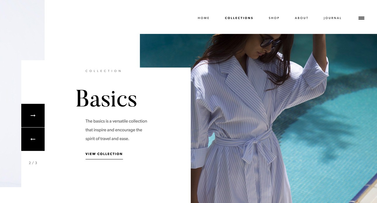
Whether we like it or not, we have to start thinking about it, flat design is going out of fashion: there are fewer and fewer trendy sites that present themselves in the cardboard and colourful style typical of flat design. For some time now, the Material design of good old Google has begun to prevail, but now more than ever we are moving towards recreating, also digitally, the typical editorial style of fashion magazines, with real photos instead of geometric illustrations, a great use of graceful fonts of disproportionate size, and a nice parallax scrolling effect to give dynamism to the whole.
Typography on the web: Big & Bold
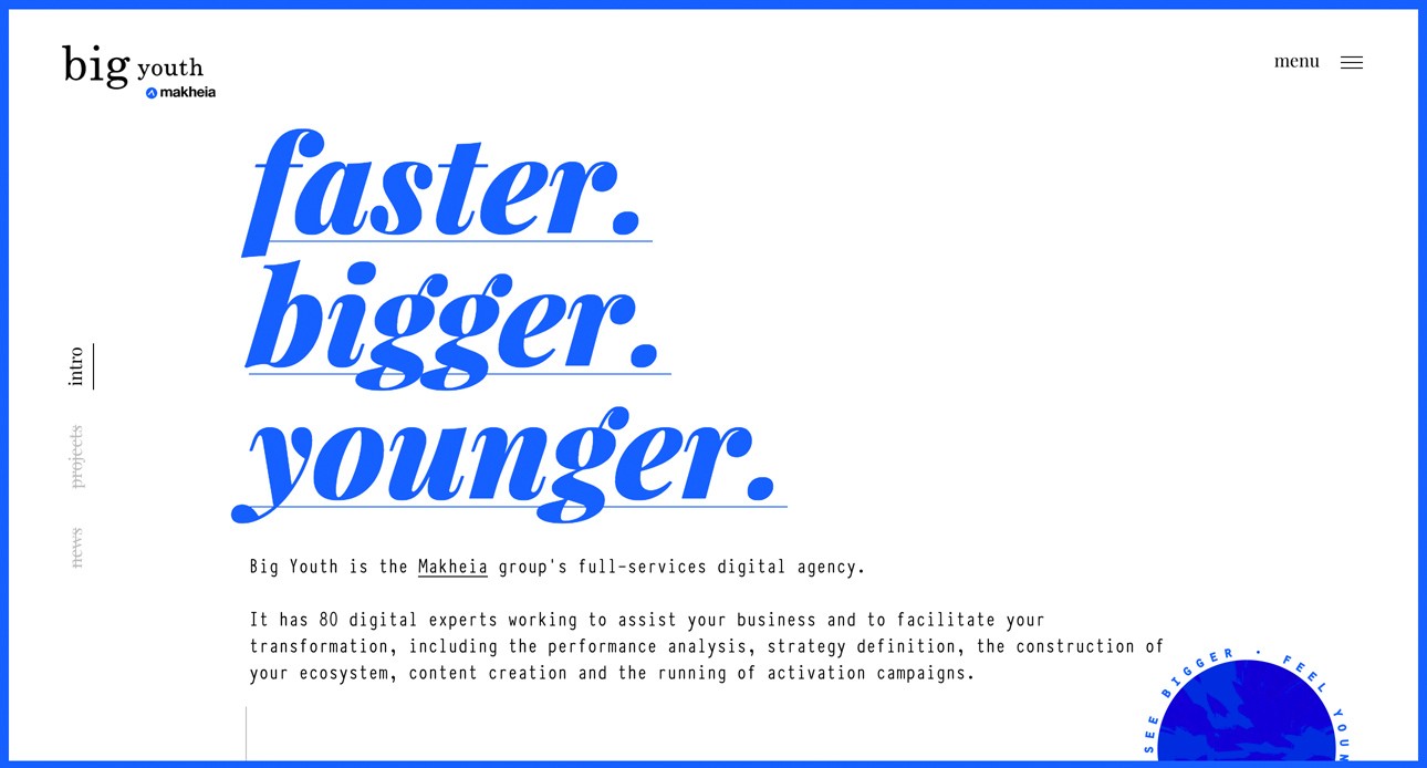
As already mentioned in the previous point, fonts are growing by the day: home pages with large typefaces, both in weight and proportions, are becoming increasingly common, with the intention of impressing the user and communicating a simple and concise message that sticks in the user's mind. Apple, too, with the new iTunes and AppleMusic interface, decided to opt for a very large but above all bold font-size, something it had not done for several years.
Geometric shapes, lines and patterns in web design
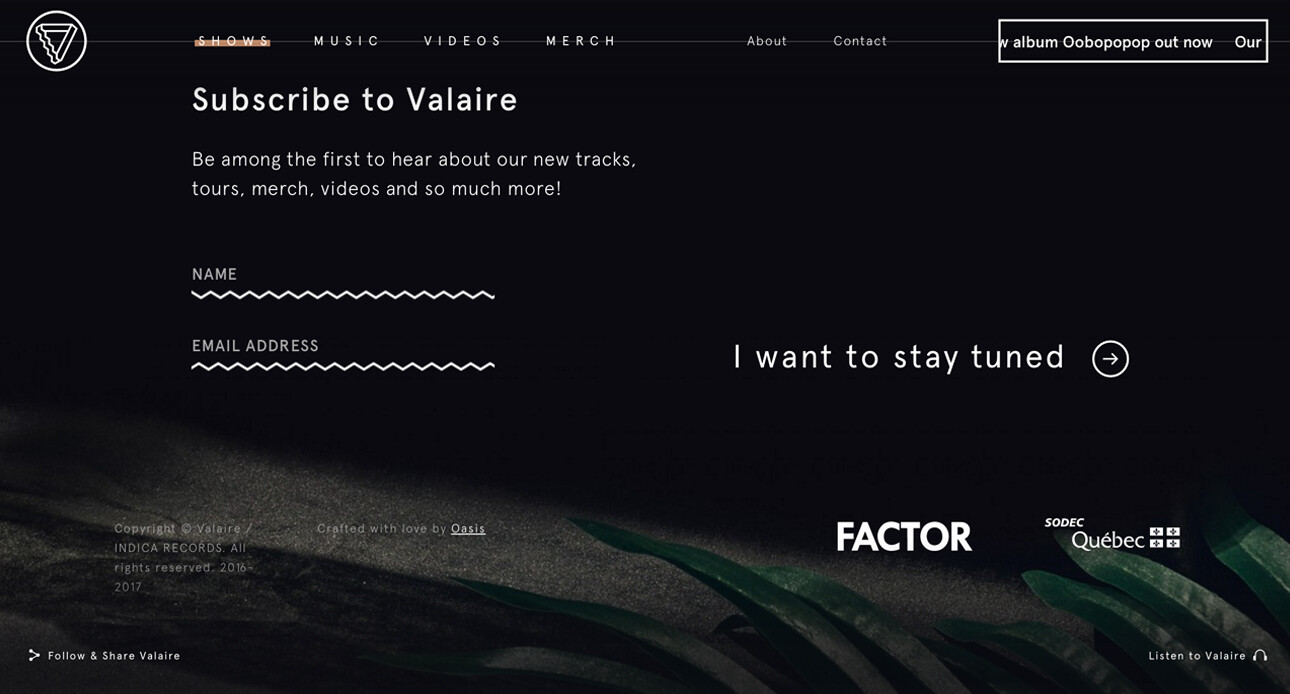
To contrast the realism of photos and videos, many web designers are beginning to insert purely graphic elements, such as icons, zig-zag or wavy geometric lines, perhaps animated when scrolling. Also common are patterns or graphic elements developed with the low-poly effect, i.e. reproducing surfaces with polygons that react differently to light, creating shadow games and, in some cases, defining real figures (a very interesting generator can be found at this link).
Animations and GIFs in websites
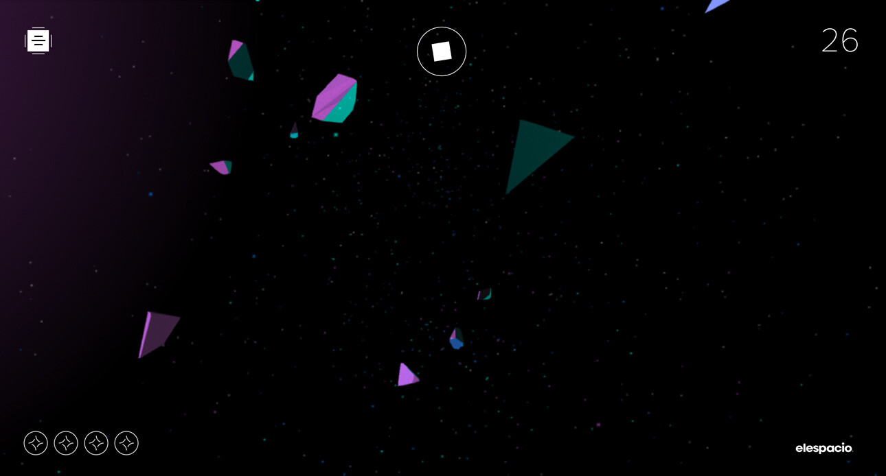
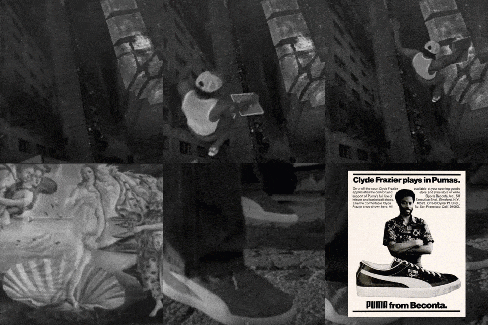
We know it well by now: GIFs have invaded our social networks and will continue to do so for the next year! Web designers are studying ever more innovative ways to exploit this technology dusted off from the 90s, primarily us with our site and the thumbnails on this blog.
Not least, the use of canvases and embed videos via HTML5 (p.s: watch out for mobile!) are also becoming increasingly popular: more and more sites are allowing the user to interact with visual effects and animations, often for purely recreational purposes.
Web layouts and construction grids
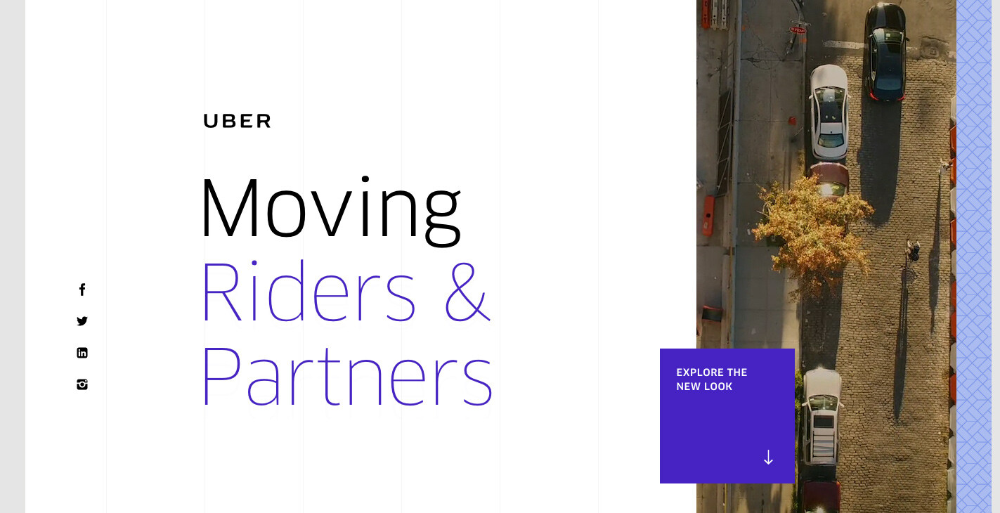
I don't know if you have ever noticed, but there is now a tendency in website design to leave the layout construction grids on which the various page elements rest visible. It is a stratagem often used for home and landing pages with lots of content, often made dynamic by parallax scrolling. Fashionable sites, with the editorial style we have already mentioned, are often designed with elements that at first glance may seem positioned purely at random but, thanks to the construction grids, we can quickly realise that each element is positioned with care and an almost maniacal logic, which manages to hold up on all resolutions, taking full advantage of the rules of responsive design.
View Project
