12 - 10 - 2020
Wine and design: how the label influences the purchase

Does the label make the wine?
Today more than ever, wine has been transformed from a food product into a consumer good synonymous with lifestyle and well-being, a topic of conversation and discussion that often requires specific expertise. Most consumers, however, do not fall into this category and, for this reason, when it comes to the moment of purchase, several choice drivers come into play, such as design.
Perhaps you too have walked into a supermarket to buy a bottle of wine to take to a friend's house, and found long shelves with labels and names that mean nothing, right?
Well, without in-depth knowledge it is very easy to get lost and go for the price or the designation that sounds most familiar. Before these two factors though, what is it that strikes us? That's right, you guessed it, we are struck by the labels.
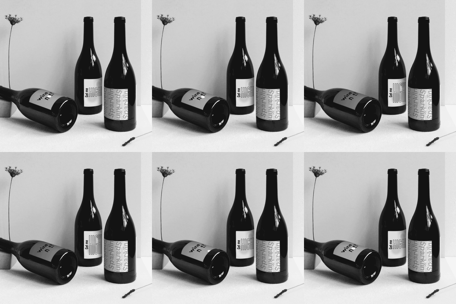
Design that complements wine communication is increasingly central and labels in this context are a key source of information, an aesthetic and perceptive connection: they have to strike the consumer emotionally in a very short space of time. Therefore, the label has a strong influence on purchasing decisions, as well as a strong importance in the consumer's decision-making process and in the communication of the product itself.
What are the key elements that seduce consumers, that make them choose one bottle of wine over another?
The shape and colour of the bottle can make a difference, but the main features are found in:
style and colour of the label
chosen graphics and font
type of paper used
A bright colour, an eye-catching inscription, an abstract design or an unusual shape are winning elements; any detail that recalls an emotional memory or a lived experience acts in the mind of the beholder and stimulates his attention. Therefore, a winning visual communication will leave its mark even after the actual tasting.
Now back to the initial question: "Does the label make the wine?". The answers are yes... and no! We can compare a bottle of wine to a perfume: we love its name, the notes it contains, its bottle; but it is only if we feel comfortable wearing it, if we receive compliments from those who smell it, if we feel it is ours, that it will not be forgotten along with its aesthetic value and will lead the consumer to buy it again.
As oenophiles by aspiration, we had the pleasure of collaborating with Azienda Agricola Beatesca, creating the label for their Ilex wine, an intense ruby red IGT. What are the elements that characterise it? Find out by clicking below.
Case History Ilex
View Project

