25 - 03 - 2017
Parallax scrolling: how to make the UX more pleasant [case history].

Parallax scrolling is a technique that is now highly developed in frontend development. Parallax, in Italian parallax, derives from the Greek and means overlapping: the main effect obtained involves the superimposition of various elements within our page, which move when scrolled at different speeds. In motion graphics, this expedient was used even before we saw it on the web, to obtain a three-dimensional effect in which the background images move more slowly than those in the foreground.
When to use parallax scrolling
It is possible to obtain a perfect parallax scrolling effect on relatively long pages: this allows us to have the 'room to manoeuvre' necessary to scroll the page and notice the overlapping of elements at different speeds. The effect does not have to be excessively noticeable; it really only takes a few tricks to make scrolling more pleasant and fluid than the standard linear scrolling.
Thanks to parallax scrolling, the user will feel catapulted into the page and images, creating fantastic three-dimensional and zoom effects. The effect can be applied to both photographs and UI elements, but also to typefaces and background patterns.
How to design a web page with parallax scrolling
Designing a web page with the effect of parallax scrolling involves an in-depth study of the structure of the page and the effects that the various elements must possess when scrolling.
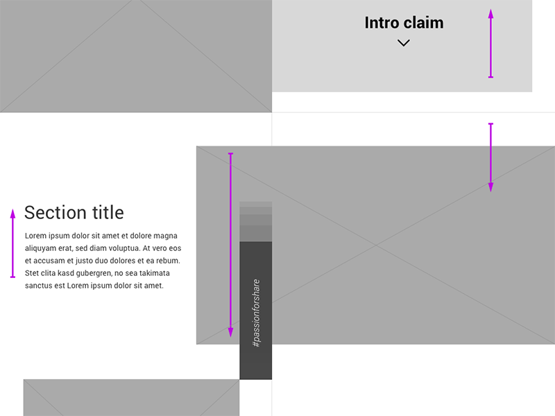
For the development of the home page and some internal pages of the Souvenir Clubbing website, we first of all created wireframes, i.e. a scheme of the page contents, completely in black and white. This allowed us to study the main effects and at what speed they had to move.

With wireframes, distracting colours, images and typography can be eliminated: all attention is devoted to content hierarchy and user experience.
The frontend development of parallax scrolling
For this project we decided to rely on a powerful jQuery plugin which enabled us to realise each parallax scrolling effect as precisely and smoothly as possible: its name is Skrollr and you can download it from its github repository at this link: https://github.com/Prinzhorn/skrollr.
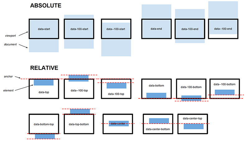
Combined with the grid system of our Framaework, we were able to manage each element in such a way that each scrolling effect occurred exactly at the desired time: Skrollr's anchoring system manages breakpoints very precisely.

Conclusions
In conclusion, developing a page with the effect of parallax scrolling requires specific expedients that allow us to obtain a pleasant scrolling, improve the User Experience of our pages and give that touch of dynamism to any type of content, but beware: without due study and design, the effect can be intrusive and lower performance considerably, creating jerks and delays during navigation.
You can see the result of our work at www.souvenirclubbing.net or watch a preview of the parallax with the video below.
View Project

