Kobak a project in color
A reality tailor-made for the brand. Real content mixed with AI content, an evocative union that expresses the whole brand.
Deliverables
Kobak is a portable restroom company that operates throughout Italy and France. The brand moves daily between institutional reality and colloquial reality, so the strategy is focused on how to best render this dual soul of the brand on all available touchpoints.
The website has been conceived and designed to encourage user interaction.
There are several sections dedicated to this purpose such as:
- The portable toilet configurator, which allows the customization of portable toilets in real time (here is another example of a configurator);
- The toilet calculator;
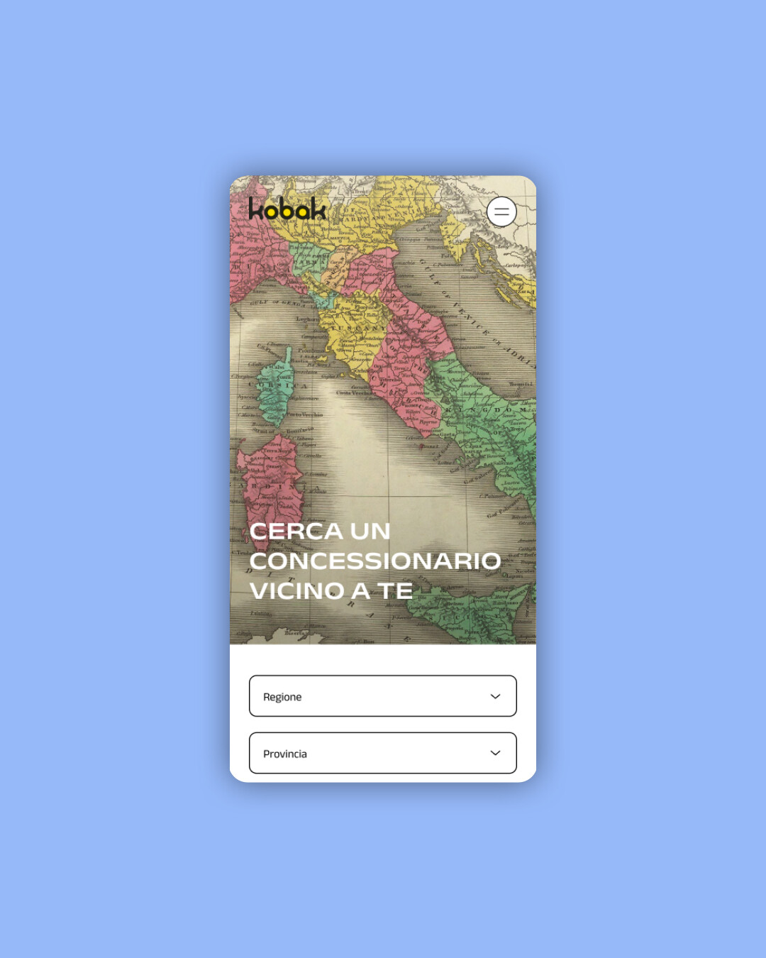
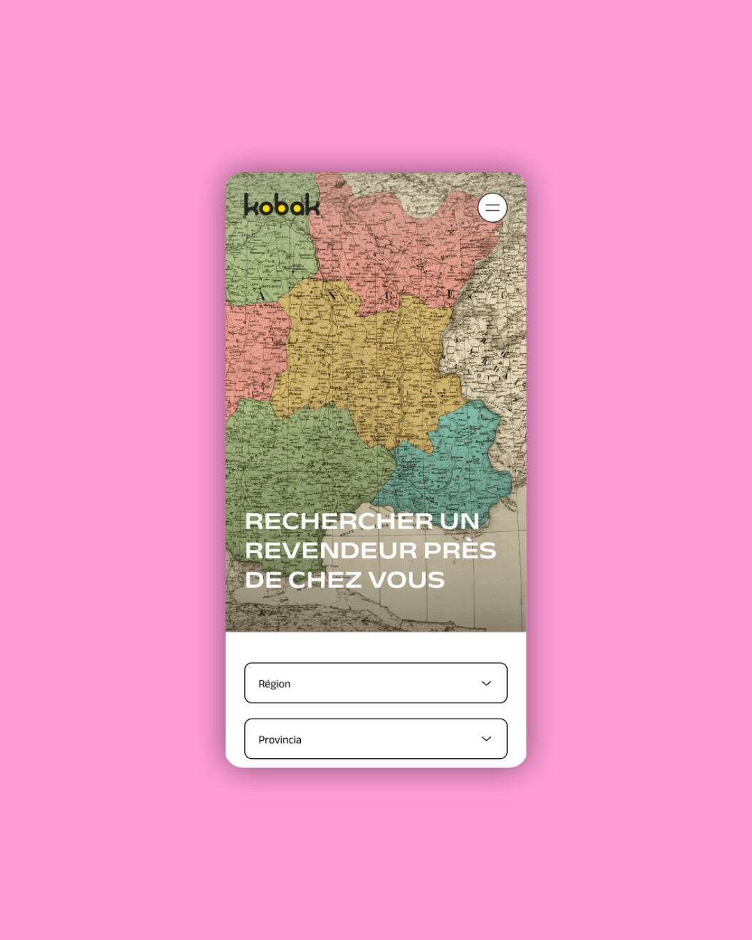
- The geolocation of dealers.
Each of these elements was designed following A/B usability analysis to develop an effective and functional user experience.
Real content VS Fake content
Beyond the development of the website in line with Wes Anderson's aesthetic style, we also made a commercial video that can unite these two sides of the brand.
The concept is designed to deal with a difficult topic such as chemical toilets in an ironic and clear key, and render through a video the fundamental concepts on which Kobak pivots.
A content that talks about the company by focusing on the brand process of the K Circular System . The video reflects Kobak's personality and work, where the technical language of the brand is mixed with the light mimicry and ironic movements of the narrator.
The colors remain a predominant element in the video, able to reinforce and follow the brand awareness.
Kobak Calculator
A WC calculator has been implemented within the site. This system works on the basis of an algorithm that, in addition to profiling Kobak's prospects, recommends the number of toilets needed for their needs, in accordance with the European regulation on portable toilets.
The calculator encourages user interaction and optimizes the lead generation action of the website.
3D as distinctive brand element
3D is the key element of this project and it allows the brand to express something more. 3D is used both for the presentation of the products and for all the tools of interactions with the final customer on the website, and also to communicate the brand image on all outputs.
The social media side is the one that allows us to give full vent to the use of 3D. This element is implemented in every piece of content posted on the brand's accounts, making it a distinctive feature of the brand.
On social, the tone of voice focuses on irony and color, while still maintains a technicality that is essential for the target audience but within the reach of all users.
Care for the environment
As a BCorp agency, we collaborate with brands that pursue the same environmental goals as we do. Therefore, communicating the ecofriendly aspect of Kobak to the best of our ability was a priority.
Kobak is distinguished by an internal system, the K Circular System - a business process that allows Kobak to reuse obsolete portable toilets to generate new ones, so that waste material is never created and a circular economy system is carried forward.
This focus of the brand on the environment makes it closely akin to our corporate vision.
Kobak operates in Italy and France, so the search for a dealer is calibrated to the Italian and French localization. This gives a much larger overview to those who land on the site, and communicates the internationalization of the brand.
Kobak an ever-changing colorful world
- Strategy
- Branding
- Digital
- Content